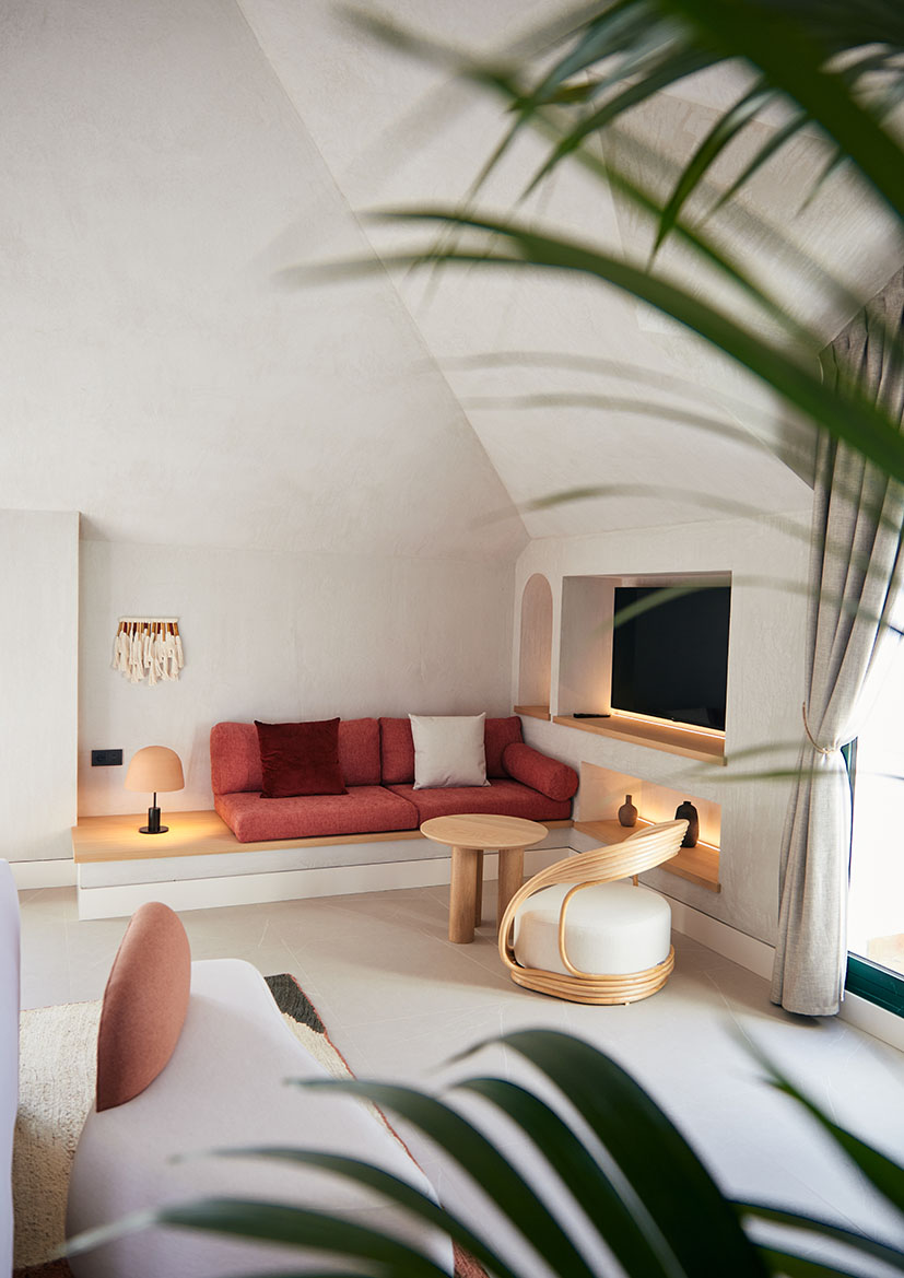
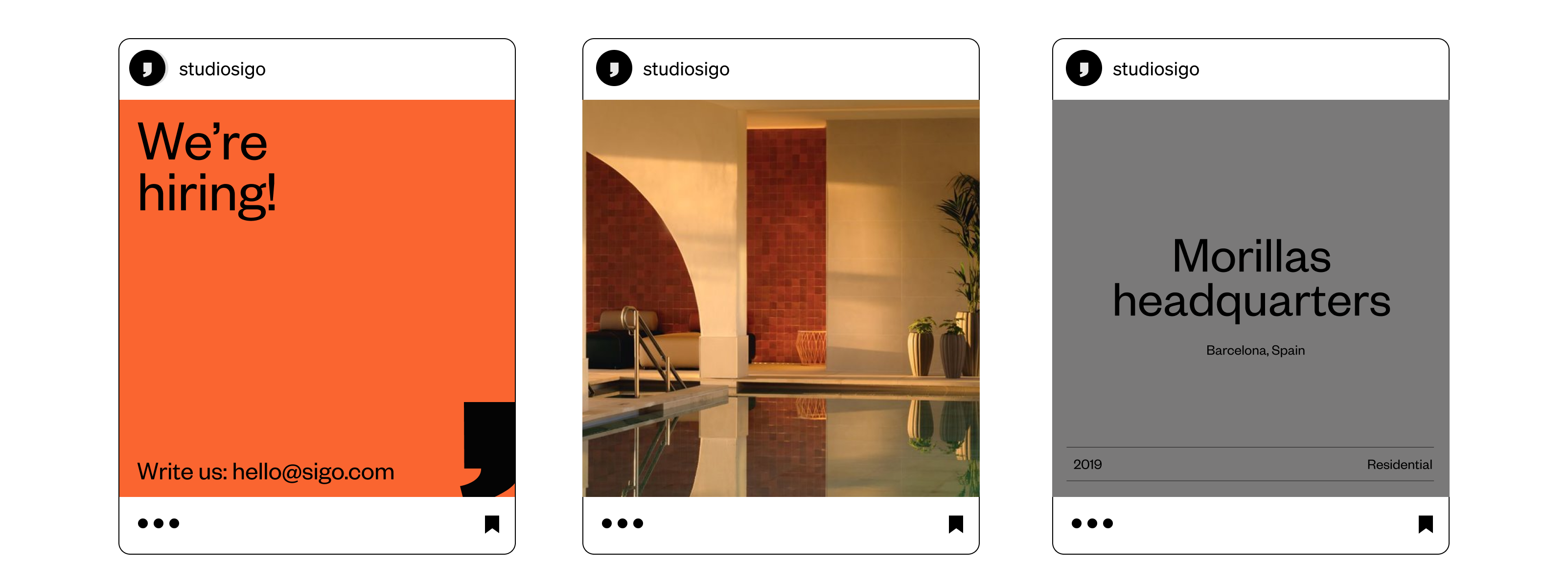
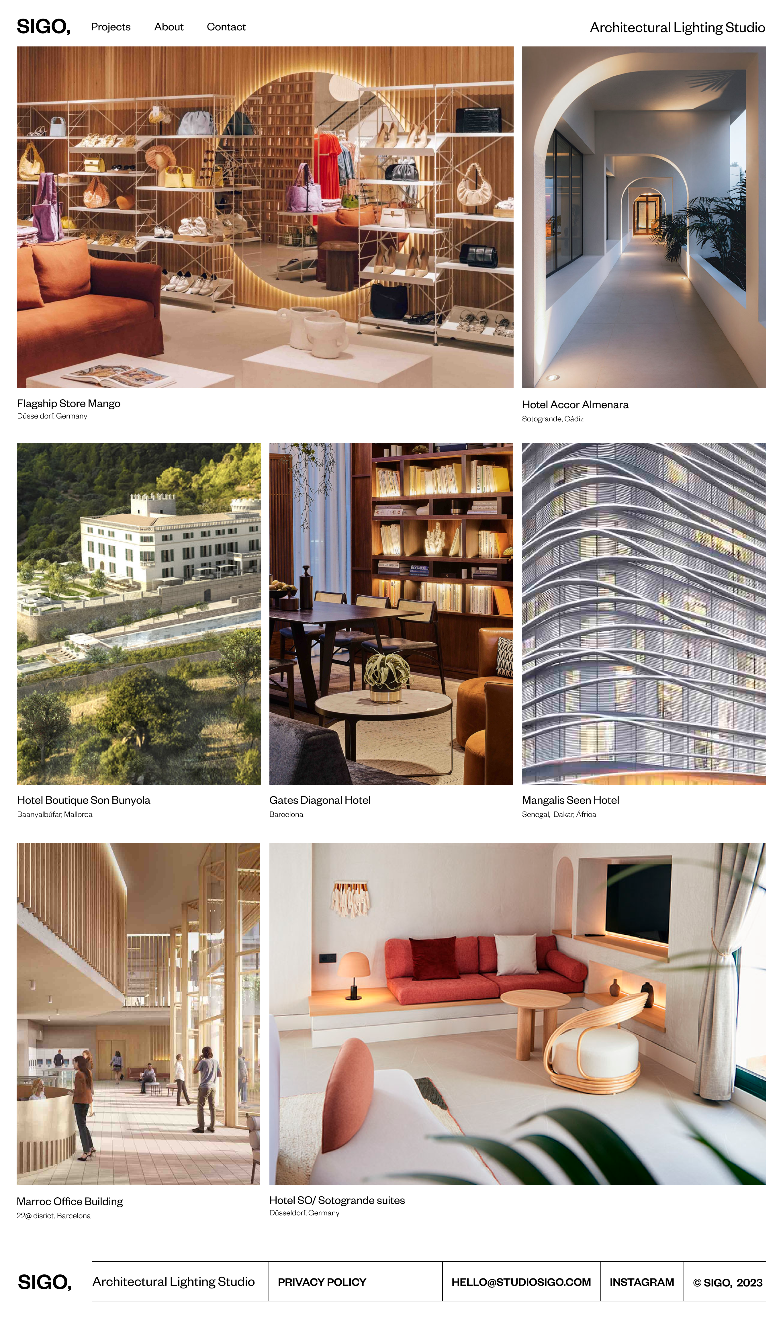
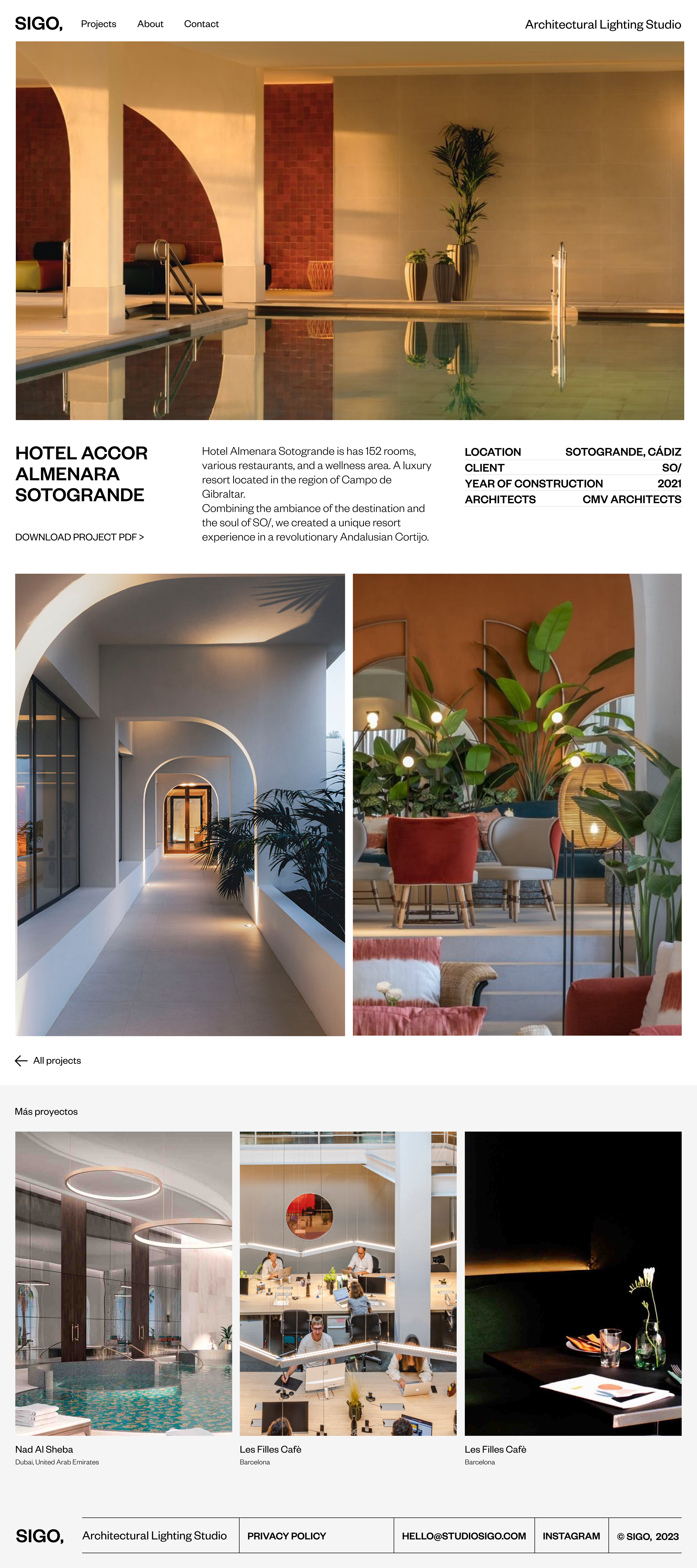
The Barcelona based architectural light studio set us the challenge of creating a bold concept and identity to represent their studio. We helped them with a 360º concept and design approach starting from the naming, branding, web design and social media content.
We worked closely with them to develop a distinctive signature for the studio.
We worked closely with them to develop a distinctive signature for the studio.
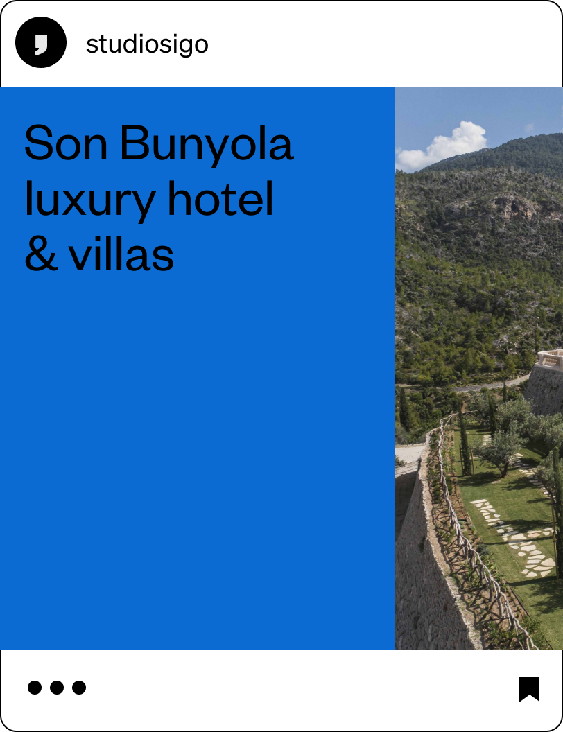
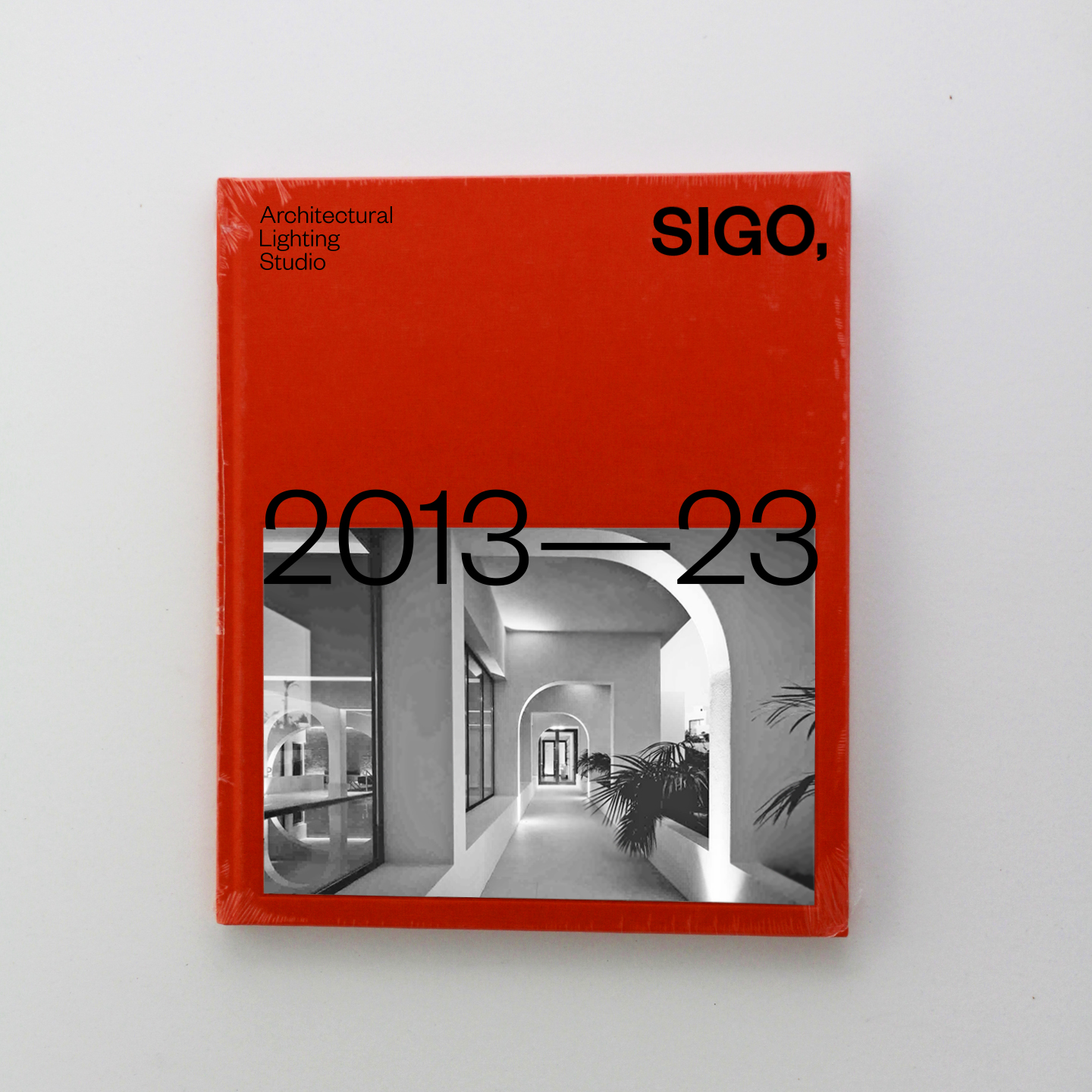
SIGO, Studio
Architectural lighting design studio
Architectural lighting design studio
What we did
Concept
Naming
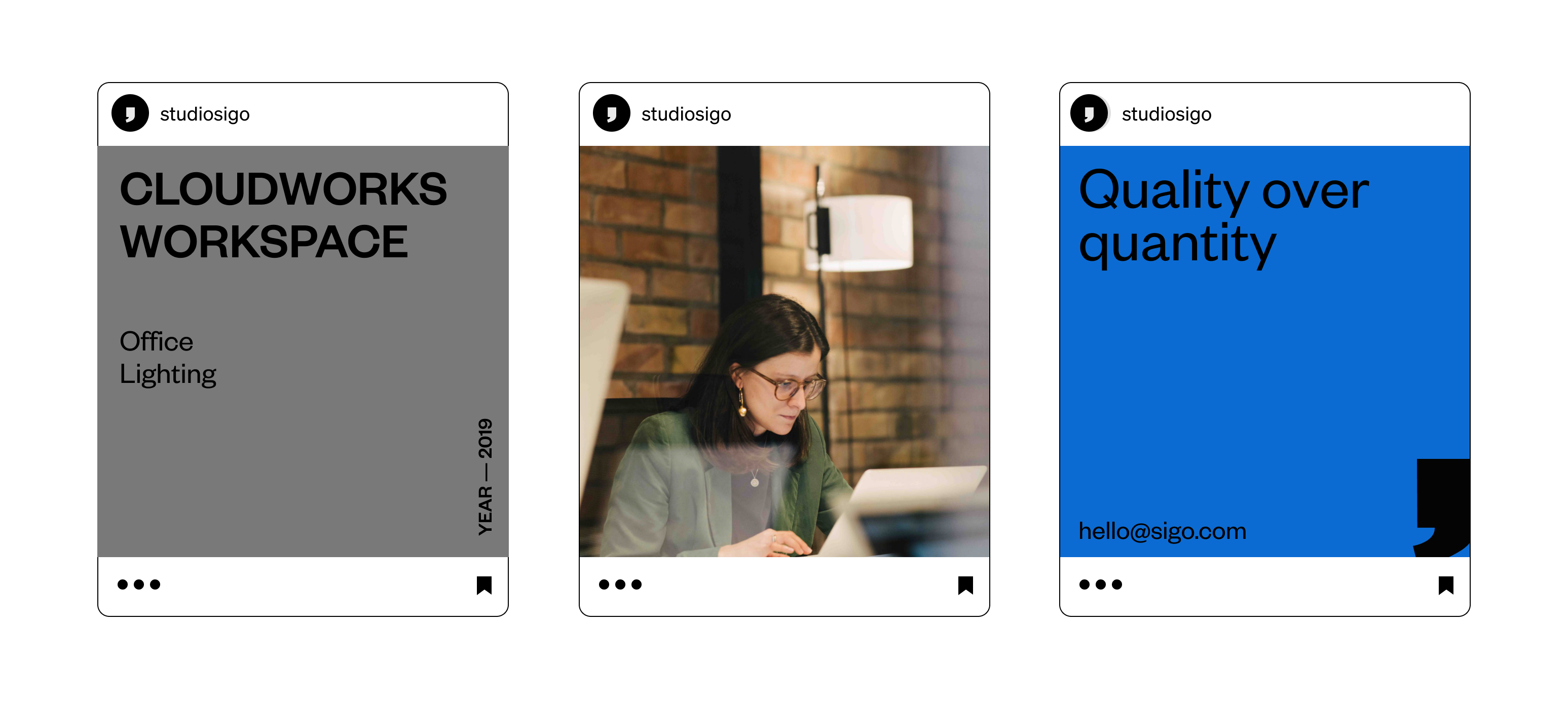
Graphic design & visual Identity
Web Design ︎︎︎
Social media content strategy ︎︎︎
Social media content creation ︎︎︎
Concept
Naming
Graphic design & visual Identity
Web Design ︎︎︎
Social media content strategy ︎︎︎
Social media content creation ︎︎︎

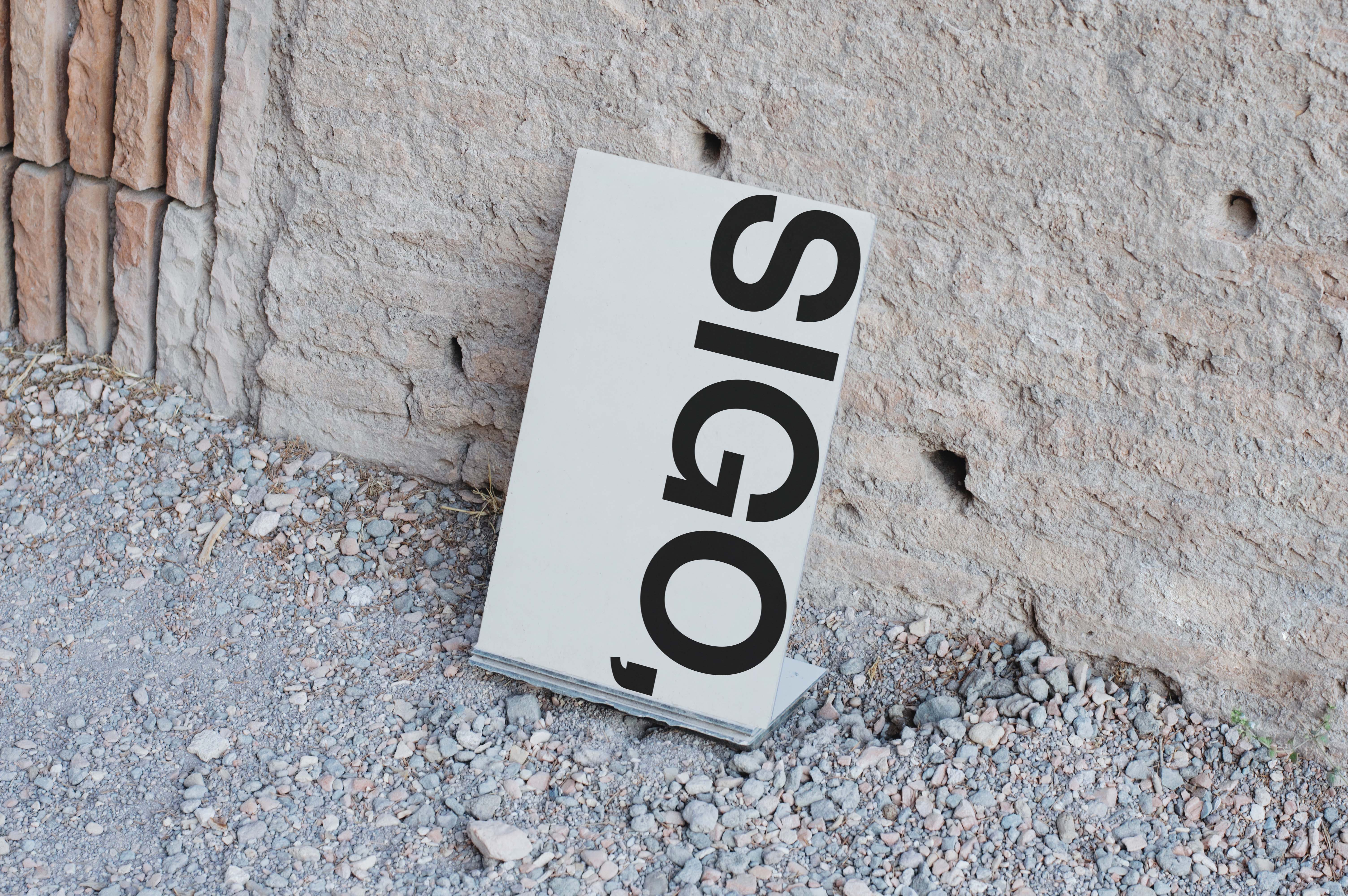
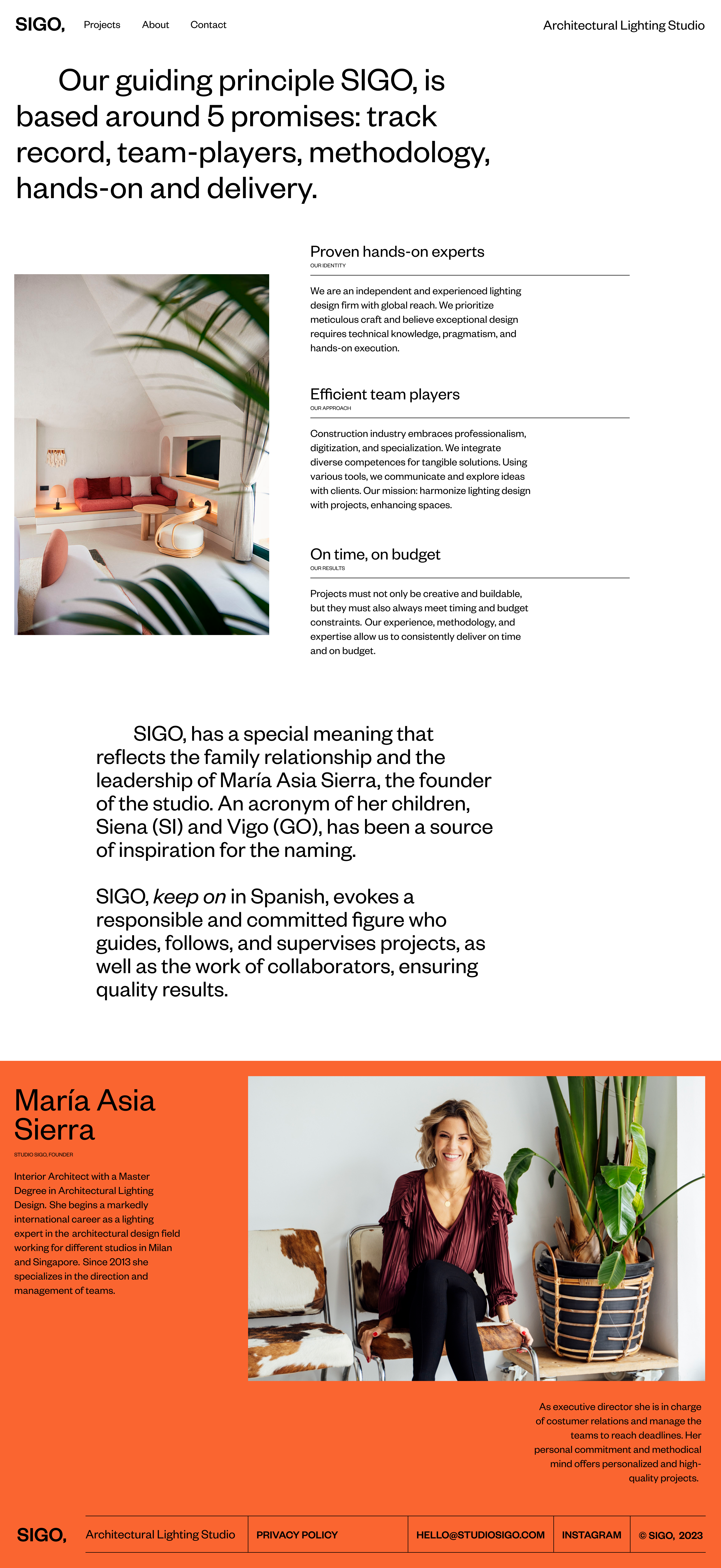
The name "SIGO" –keep on in Spanish– conveys the idea of continuity, of moving forward. This concept reflects that SIGO evokes a responsible and committed figure who guides, follows, and supervises projects, as well as the work of collaborators, ensuring quality results. It has a special meaning that reflects the family relationship and the leadership of María Asia Sierra, the founder of the studio. An acronym of her children, Siena (SI) and Vigo (GO), has been a source of inspiration for the naming.
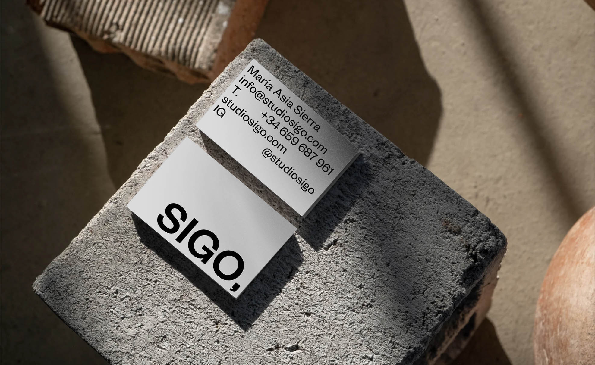
For all these reasons, an iconic symbol was necessary to enhance these qualities—a visually distinctive emblem. By associating the meaning of the comma (,) with concepts such as tracking and continuity, a visual and conceptual connection is established that reinforces the identity and purpose of the studio's name.