We were asked to create a memorable art direction for MAZO smash burgers to launch the new brand.
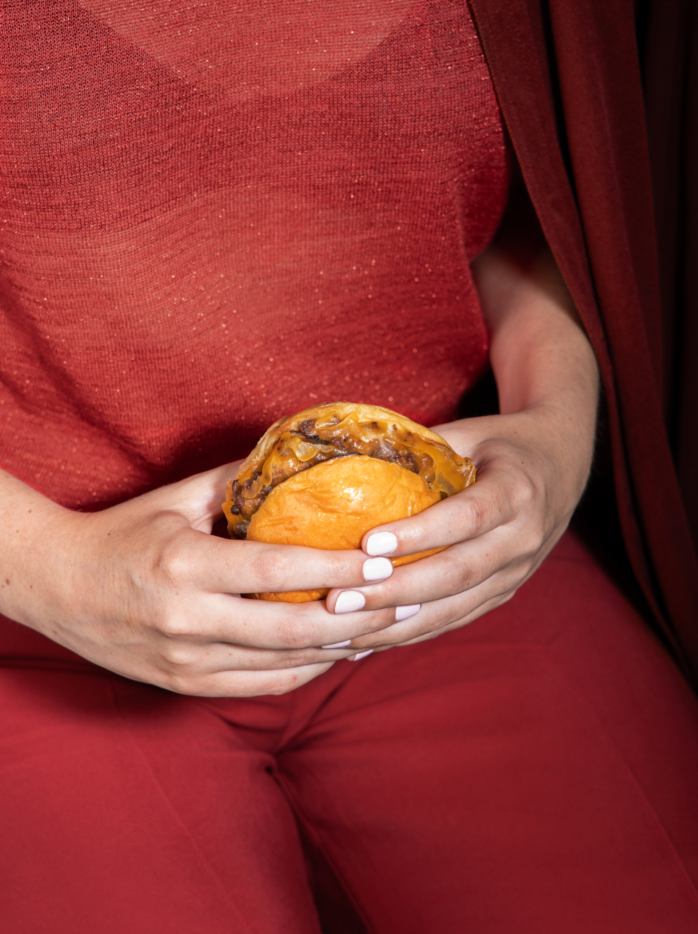
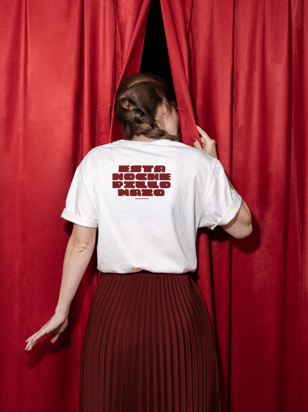
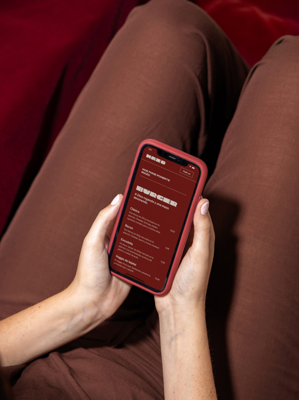
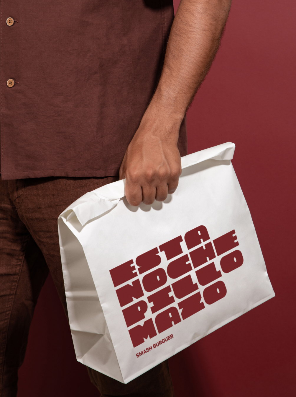
The visual trick will rely on us perceiving that home environment without actually seeing it, that nighttime consumption moment without explicitly displaying it, and that young consumer without needing to see their face.
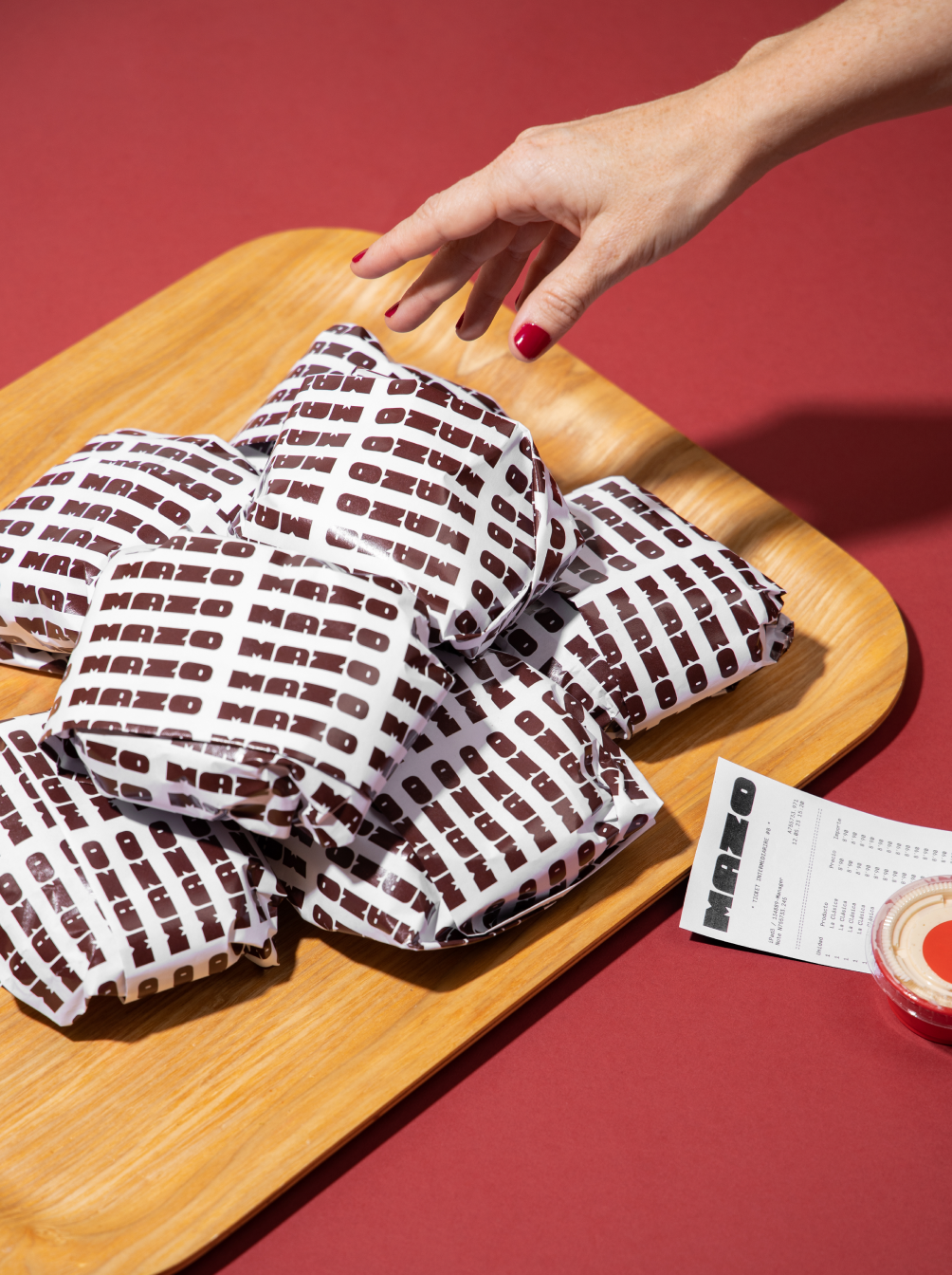
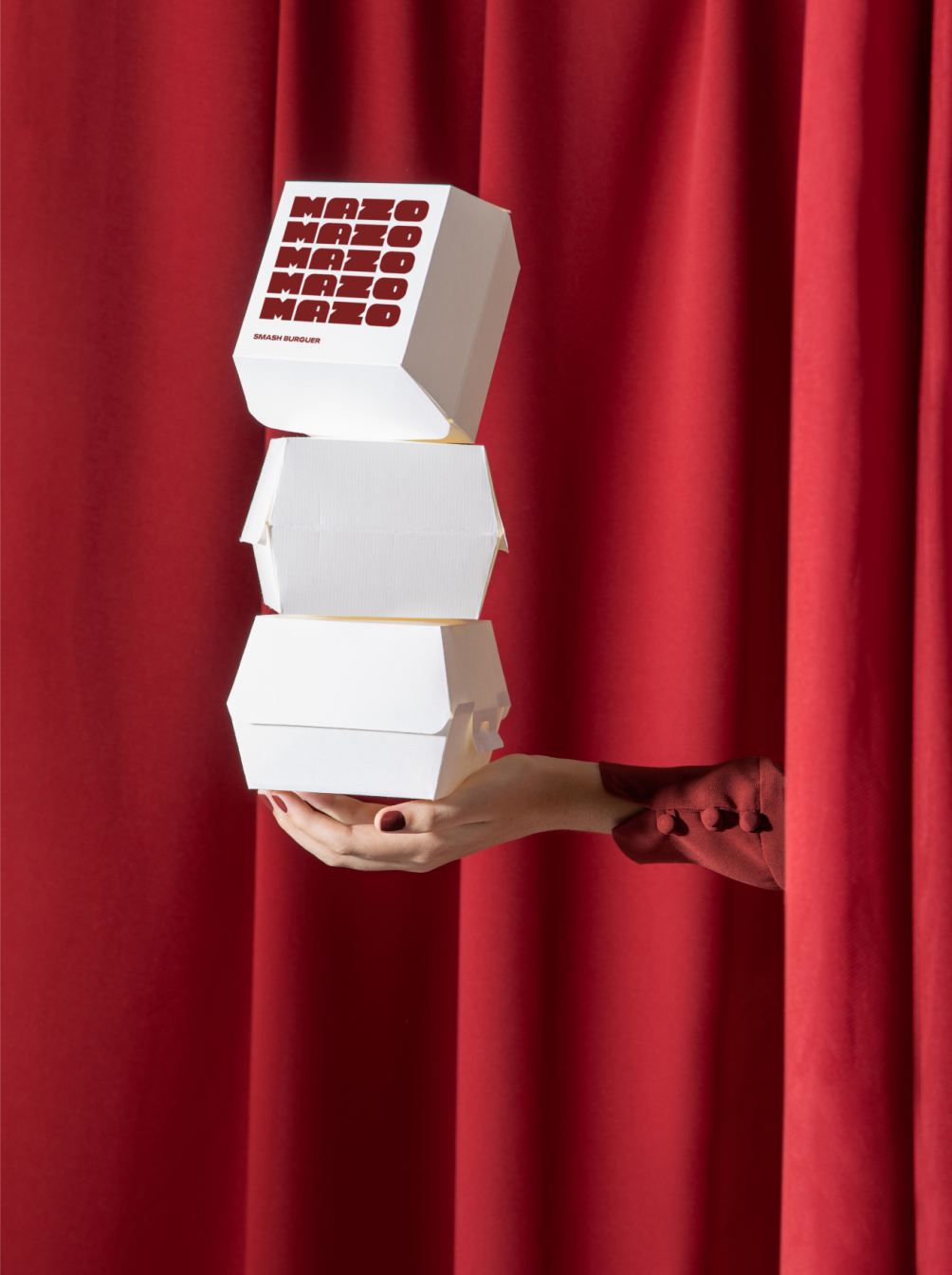
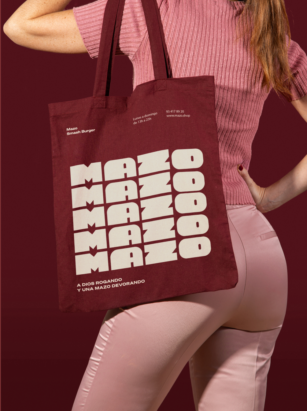
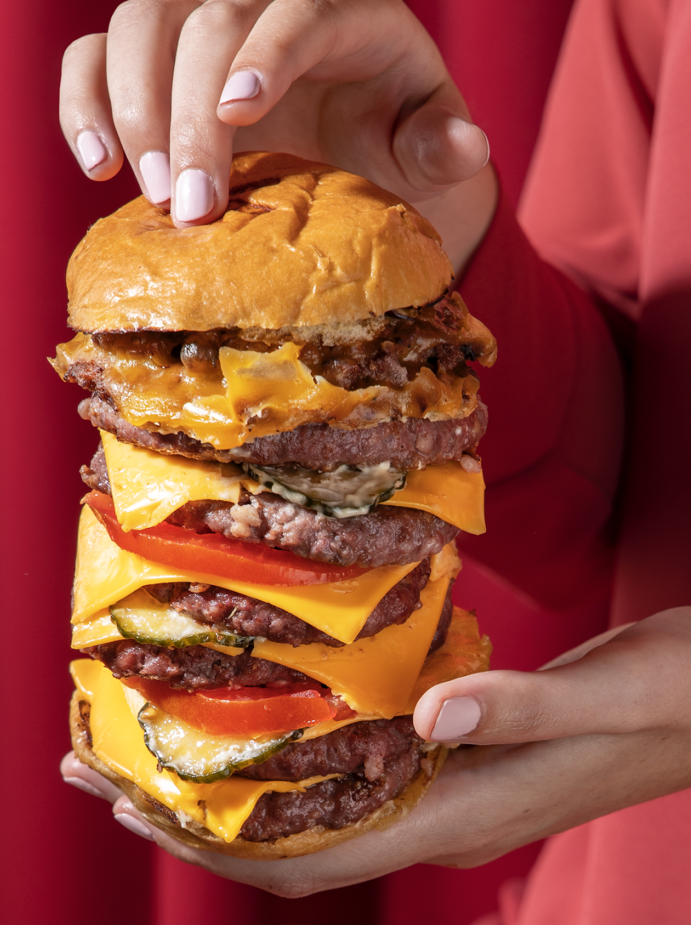
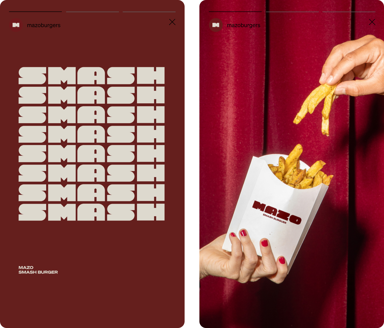
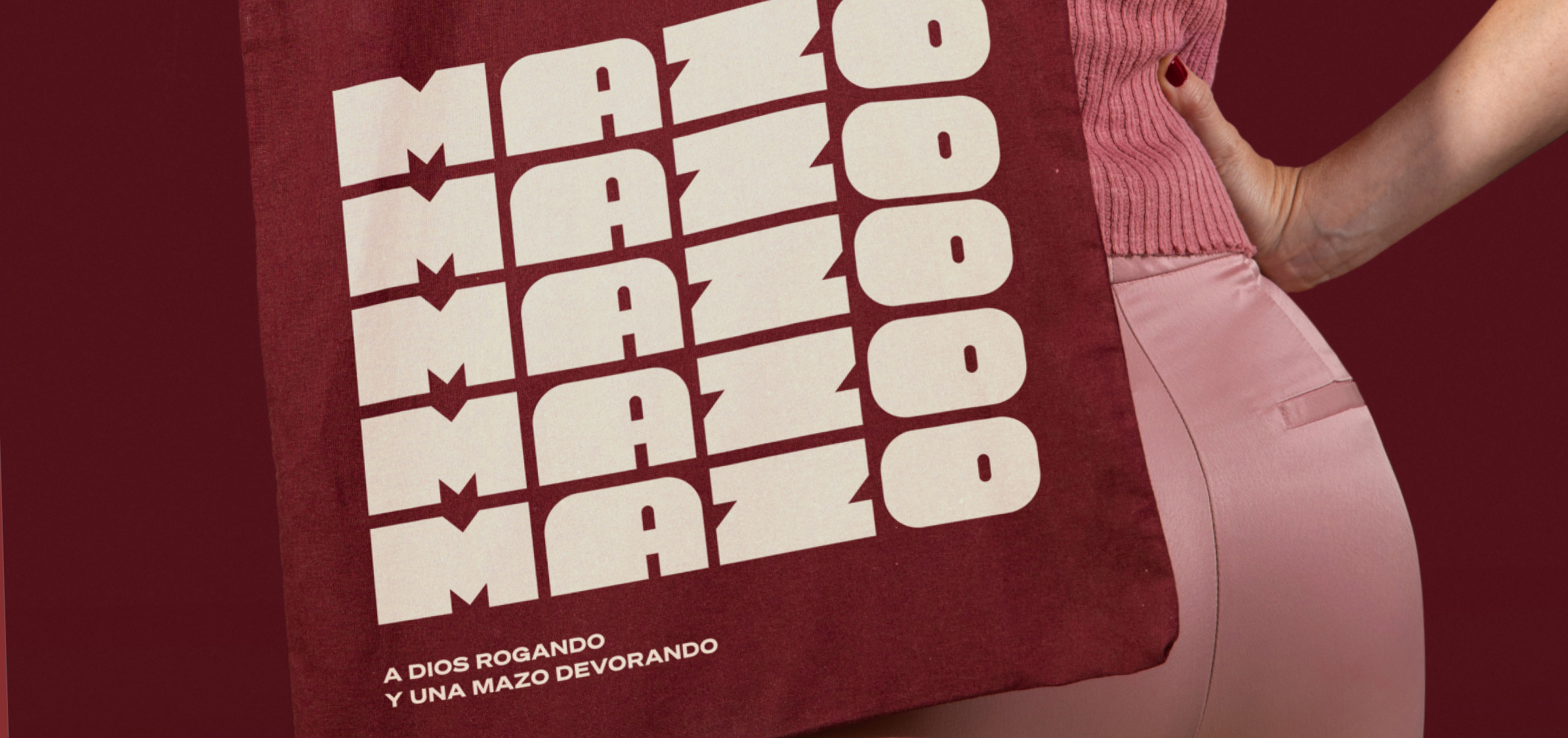
The aim is to create a memorable brand code aligned with the visual identity and its brand typography. To achieve this, we chose to set the art direction in a monochromatic environment, from people's clothing to tableware and backgrounds.
The visual trick will rely on us perceiving that home environment without actually seeing it, that nighttime consumption moment without explicitly displaying it, and that young consumer without needing to see their face.
The aim is to create a memorable brand code aligned with the visual identity and its brand typography. To achieve this, we chose to set the art direction in a monochromatic environment, from people's clothing to tableware and backgrounds.
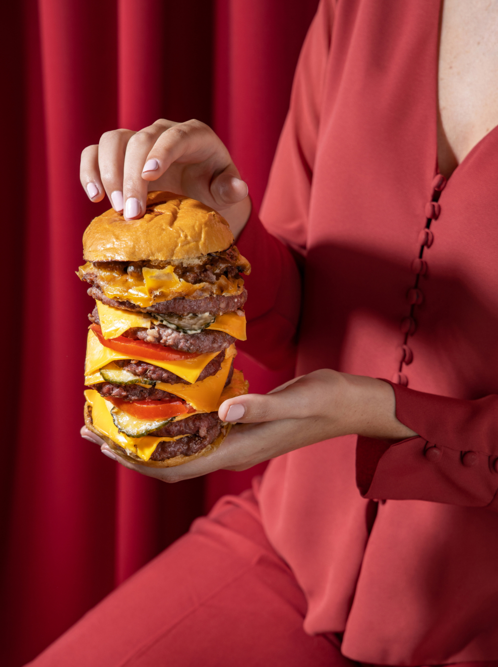
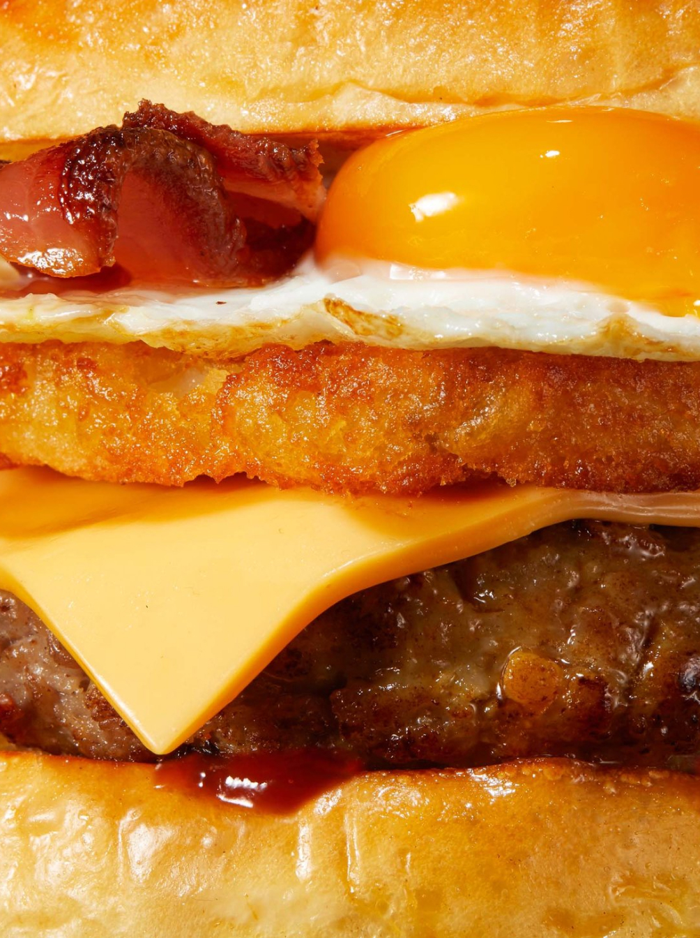
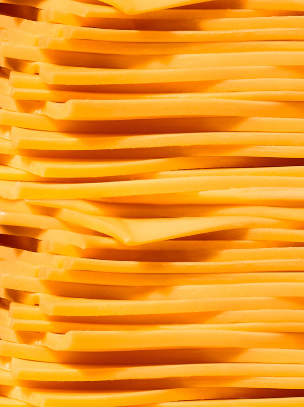
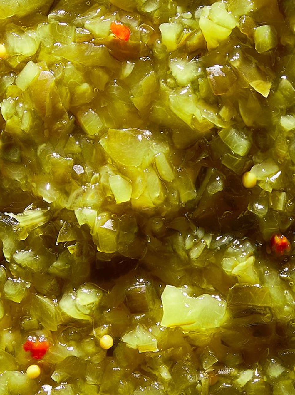
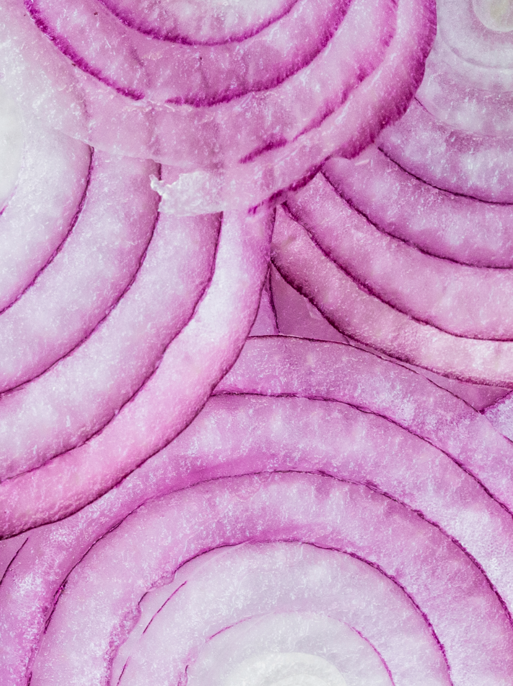
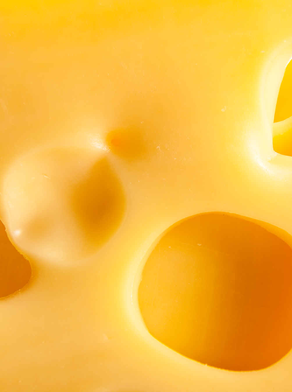
"MAZO" in Spanish is hammer or a tool used to smash a hamburger. However, “Mazo” it is also a word used as an expression to convey "VERY," with exaggerated, big or grandiose connotations. For this reason, the art direction is combined with product images showcasing the food through close-ups on a grand scale (it does justice to its name: “Mazo”).